
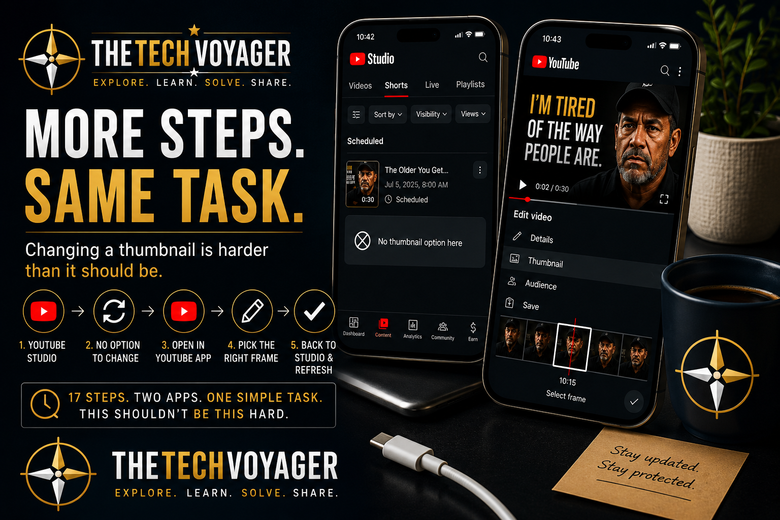
Why Changing a YouTube Shorts Thumbnail Is More Complicated Than It Should Be
BLUF: Changing the thumbnail on a scheduled YouTube Short should take seconds. Instead, the current workflow requires switching between YouTube Studio and the YouTube app, refreshing screens multiple times, and navigating through menus that seem to move with every interface update. It’s another example of how modern software can introduce friction into otherwise simple tasks.
Related Reading: The Password Was Correct the Whole Time: How Browser Privacy Features Can Break Logins
The Workflow Changed… Again
Every time I feel like I’ve settled into an efficient publishing routine, YouTube decides it’s time to redesign part of the interface.
This time, it was changing the thumbnail for a scheduled Short.
The feature still exists, but the workflow has changed enough that I found myself hunting through menus before remembering where Google moved it.
That’s becoming a familiar pattern with modern software.
My Current Workflow
Today, this is the process I follow for every scheduled YouTube Short.
- Open YouTube Studio.
- Pull down to refresh.
- Find the scheduled Short.
- Tap the three-dot menu and select Edit.
- Discover there is no thumbnail option.
- Tap the YouTube icon to open the regular YouTube app.
- Pause the Short.
- Tap the three-dot menu.
- Select Edit.
- Tap the pencil icon on the thumbnail.
- Scrub through the video frame by frame until I find the exact opening frame I want.
- Tap the checkmark.
- Save the changes.
- Return to YouTube Studio.
- Refresh again.
- Verify the thumbnail updated correctly.
That’s sixteen separate actions just to change a thumbnail on a thirty-second video.
Why the Thumbnail Matters
YouTube automatically selects a frame from the Short if you don’t choose one yourself.
Unfortunately, the automatic selection often lands on an awkward moment—halfway through a sentence, an unflattering facial expression, or a frame that completely misses the video’s opening hook.
For example, instead of displaying the intended opening statement, YouTube may choose a frame halfway through the discussion that provides little context for viewers scrolling through their feed.
For creators, that first frame functions as the title page of the video. Choosing the right one matters.
The Real Issue Isn’t the Thumbnail
I understand why YouTube limits Shorts thumbnails to frames from the video itself.
That’s not the frustrating part.
The frustrating part is that managing the video happens in one application while editing the thumbnail happens in another.
Instead of a single workflow, creators bounce back and forth between YouTube Studio and YouTube, refreshing screens and navigating multiple interfaces to accomplish one simple task.
Technology Should Reduce Friction
This isn’t unique to YouTube.
Many modern applications continue adding features while simultaneously moving menus, redesigning interfaces, and changing workflows that users have already learned.
The functionality isn’t removed.
It’s relocated.
The result is that experienced users spend more time searching for familiar tools than actually using them.
Lessons Learned
- Interface changes can have a larger productivity impact than missing features.
- Small workflow changes become significant when repeated every day.
- The first frame of a YouTube Short matters more than many creators realize.
- Consistency is often more valuable than redesign.
- Good software should reduce friction, not increase it.
Final Thoughts
Changing a thumbnail isn’t difficult because the task itself is complicated.
It’s difficult because the workflow has become fragmented across multiple applications.
When you’re publishing one video, the extra steps are easy to overlook.
When you’re publishing Shorts every day, those extra taps, refreshes, and app switches add up.
Sometimes the biggest productivity killer isn’t missing features.
It’s having to relearn where the existing ones went.